
Ultra Compose
UX designs for an MVP
Background
In 2021, GM teams created the Ultra platform, dedicated to facilitating the building of websites like Chevrolet.com/electric, Cadillac Lyriq, CarBravo, and other sites around the globe. The CMS behind Ultra is Strapi, an open-source, headless CMS tool.
General Motors sites have been increasingly using Ultra over the previous Quantum CMS over the spread of time.
The Problem
As a headless CMS, Ultra remained a platform that could only be leveraged by developers.
Relying solely on developers to perform page-building- whether the initial build or smaller updates down the line- is an expense of resources that could be otherwise allocated to projects of high priority.
The Goal
Design a UI that would allow non-developers to complete page-building activities (create, update, and manage web content and assets) and make webpage construction more accessible, alleviating the reliance on developers to do these tasks for them.
Project team
🙋🏻♀️
My Role
Research
Wireframes
Mockups
Hi-fidelity prototypes
🕚
timing/efforts
~12 weeks (target end of May)
~4 epics, ~12 features
🎨
Design team
Vanessa Martin - Lead Designer
Tariq Mohammed Ali - Designer
🖥️
Product team
Rishabh Prasad - Lead Product Owner
Foley Ma - Software Development Manager
Matthew Wirtz - Information Architect
Kendall Rundquist - Software Engineer
Alex Ha - Software Engineer
Types of users/personas
While Ultra Compose will allow any individual from developer, product owner, designer, to third party agency to perform page-building activities, there will be users of different permission-levels that contribute to the overall publishing flow. The different user levels would be:
Edit + Publish
Edit Only
Advanced Composer: Code Editor
Publisher
Analytic
User Journey: Editor
We created a basic user flow to show the user experience we desired for Ultra Compose for basic users with editing capabilities. This encompasses the journey from entering Ultra Compose to completing a page-building activity and publishing changes for admin approval.
Our minimum viable product would need to satisfy the conditions represented in the flow, with supporting screens and functionality for each node.
Publish Flow
While the user journey map highlights the steps a user with baseline editing capabilities will experience, a higher-level publish flow works in the grander scheme.
I created this “publish flow” to show how a page progresses through authoring/draft, review/approval, and publishing states via users of different approval levels.
Competitive Audit
I conducted competitor audits on popular content marketing systems to see what features are most popular and baseline. Popular features are indicative of what tools users expect to find and may already be familiar with, which the inclusion of will allow for more seamless adoption.
In addition, I browsed support forums of these CMSs. Doing so allowed me to see what existing pain points were of competitors’ users and help get an idea if there’s unaccounted for features that would provide for an elevated user experience. Most of these findings were considered “nice to have”s and therefore not P0 for our MVP, but were noted for future improvements down the line.
Information Architecture
I created a visual representation of the planned architecture of Ultra Compose, showing how each tool nests within a larger feature of the CMS.
There are 4 epics; Composer, Asset Manager, Access/Permission Control, and Architecture/Design. Under these 4 epics are 12 features, or core functions of the platform.
Collaboration
I closely collaborated with the Information Architect to answer the questions “How do we address these new problems?” as we encountered new obstacles as the design and flow developed and expanded.
On top of biweekly meetings with the development team to discuss UX and product improvements, there were plenty of adhoc meetings that were spurred by an impromptu idea any one of the team had so we could quickly brainstorm, sketch, and talk through how to make the idea real and meaningful.
Early Exploration
One of our team members on the product side strongly wanted us to explore the idea of a horizontal-style page-building architecture as opposed to the traditional vertical. His idea was that we consume information left-to-right, so we should be different and offer this new method.
After creating some concepts of how this idea might work to fully explore this new concept and gathering feedback from designers outside of the project, my design teammate and I found this visual of page-building could be very confusing to non-tech folk who are used to consuming web information through traditional vertical scrolls.
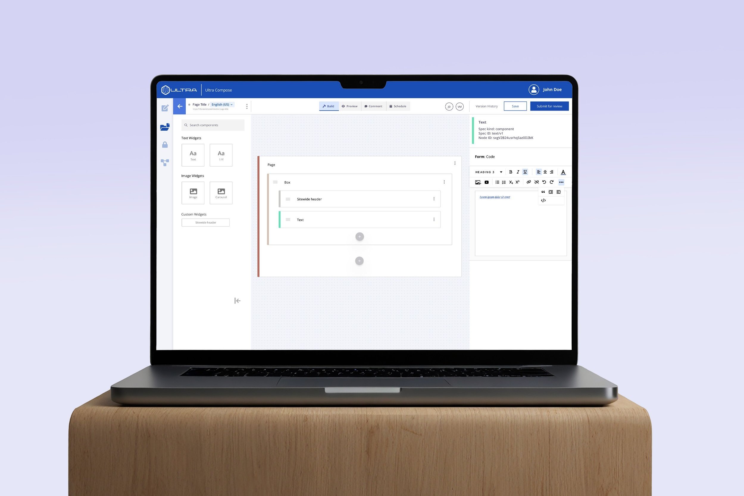
Wireframes
I built wireframes to block out the layout and general screen progression of the primary epics- Asset Library and Composer- to have visual representation of each feature.
Asset Manager
Asset navigation
Asset browser
Asset upload
Composer
Page construct navigation
Page browser
Page/construct representation
Page/construct configuration
Lo-fi Prototype
Mockups
After creating wireframes and connected the screens via a low-fidelity prototype, I began to create mockups of the Asset Manager and Composer screens.
This included adding color, typography, and designed components (buttons, input fields, dropdowns) to create a visual representation of the developed version for our team’s software engineers to build.
These mockups were reviewed with our Ultra team and passed review.
Light + Dark Modes
Users may spend several hours in a design file building their webpage. As a result, we as designers decided offering a “dark mode” in addition to a standard “light mode” would allow users to complete their page building with less eye strain.
Hi-fi Prototype
Design Forum Reviews
With an MVP built and demo video recorded on May 24th, I took my prototype to our CX studio’s Design Alignment Meeting to present to an audience of 70+ designers across the company.
I also presented my prototype in the studio’s Leadership Design Review, where the work was shared with Design Directors, Tech Directors, Group & Senior Managers, and Lead Designers.
The overwhelming feedback was positive and showed intrigue to the platform. Designers provided additional things to consider, like:
Rules and responsibilities for user permissions
Collapsible components could be problematic for screen readers
Dev team must ensure components are coded properly
How are users onboarded and learn the system?
MVP
At the end of May, the product team recorded a demo video of the built MVP for Ultra Compose.
Ongoing
Myself and Tariq offboarded from the Ultra Compose project in the summer to focus on Europe-related projects, so my involvement ended shortly after the launch of the MVP.
I provided adhoc UX recommendations to the team on features for product improvements through August til the meeting cadence expired. Backend Ultra platform development continues through the present.